download the stylesheet
Demo 1
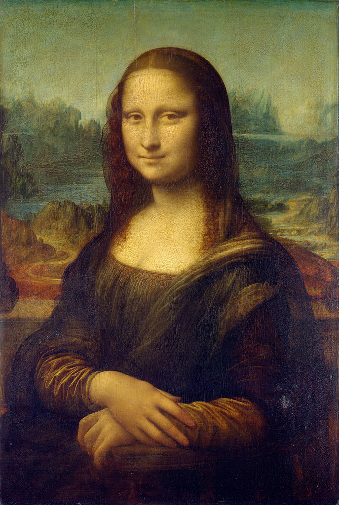
this demo shows one of the most simple uses of WP Smart Crop: making an image 100% wide, with a fixed height.
Demo 2
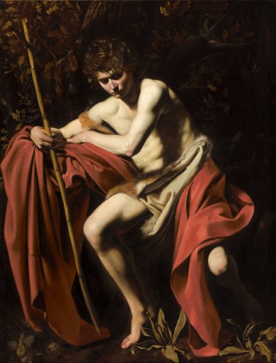
this demo places three varying images side by side at 33% of the page width each. The images match in height, despite having totally different native proportions.
Demo 3
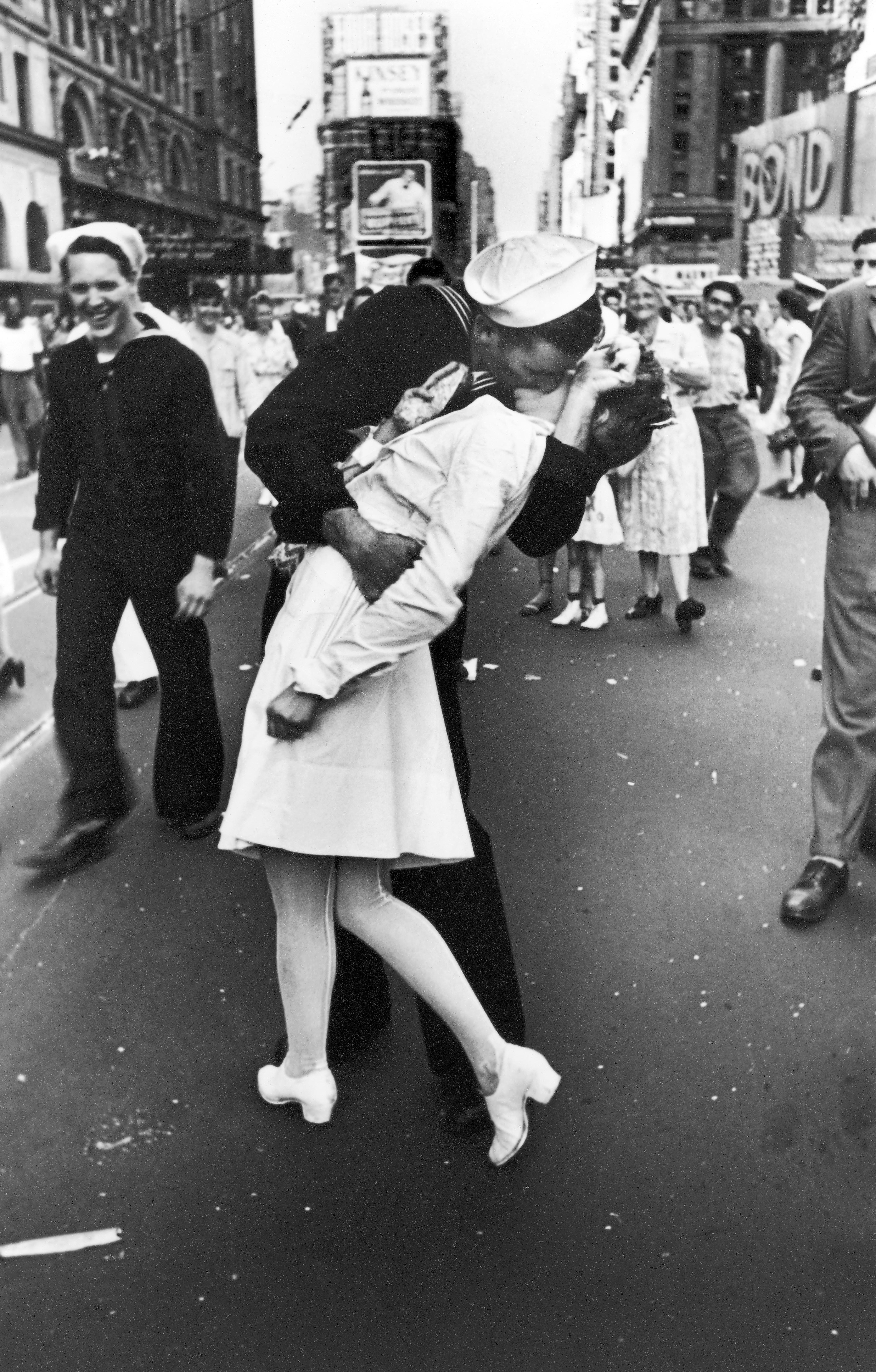
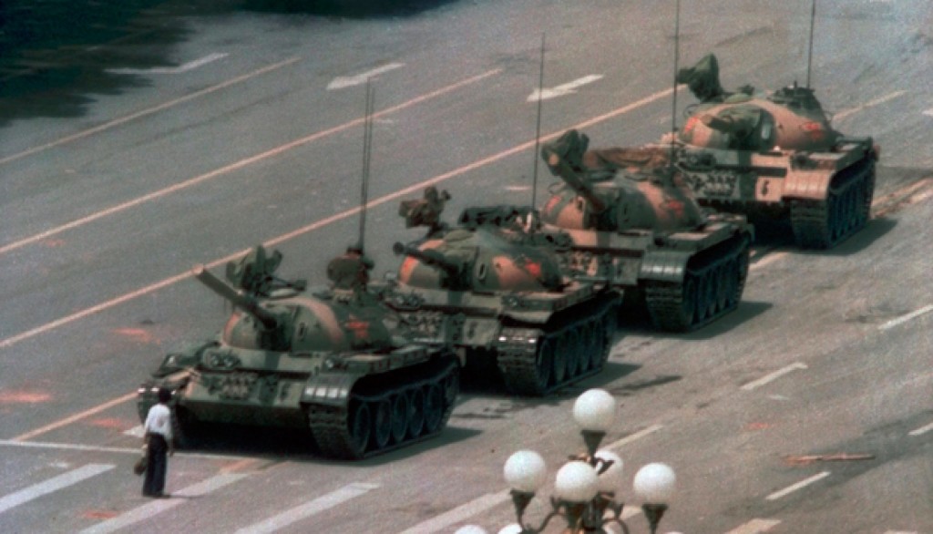
This demo shows some more advanced tricks, where image height is matched to content height, and the layout reflows at smaller sizes, using media queries.
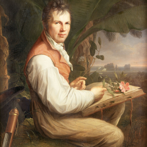
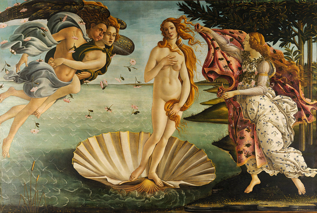
At desktop screen sizes, this demo is presented as an image at the left of a block of text, matching its height. However, at screen widths below 520px wide, it displays as a stack, with the text appearing below a short image. Note that the actual image resource stays the same for both of these views.